Thursday, October 31, 2013

Wk10 Maze Modeling Concept Phase


That's my floor texture.


That's my main wall texture.


That's my secondary wall texture.


That's my sky/roof texture.


Here is the rendered 3D view of my textures, we still didn't learn how to do lighting so it is pretty dark and the texture of the walls and the sky can't be seen. Also I didn't tile the floor yet, so I need to tile it on photoshop and put it back on Maya.


To make it easier to see I took a snapshot of the screen, and you can see that my textures are in place and in their respective levels/layers. The sky is two grid squares on top of the floor, the walls are 2 grid squares high, and the floor is on grid square wide. Non of the textures have depth, so the floors have no height, the walls have no depth and the sky also.

Tuesday, October 29, 2013

Wk09 - Maze Design Assignment Final Draft


So what I did was I texturized my maze, with plants on the walls as you can see on the main idea. The problem was that I couldn't construct a torch, so I basically just situated the maze in the dark night but I couldn't add props into it. The sky is the one that gives the whole idea of the outdoor maze, situating it at night and the walls being plant walls and not regular ones.

Wednesday, October 23, 2013

Wk09 - Maze Design Assignment Research Phase


My idea was first to make a rounded maze, but when I showed it to Eric he said it'll be too hard for a starter to do, So I decided to tag them Medium and Hard, and make the easy maze a simple straight line with 90 degrees turns.

My main idea was from a TV Show I watched called Arrow, where the maze was round and really complicated. I think that round mazes will be harder to make so I decided to keep the plant maze, where there are no walls, but actual thick amount of plants separating each path. There is no roof cause its in an open environment and the floor has grass or forest features.


As you can see those are the textures, wall being plants all over the walls. In this maze the walls are plants. Also the floor will have forest features, like plants and grass.

The only material or prop that will be in the maze, are torches. It will depend on the time to be lit or not lit, for example if it is dark or at night, the torch will be lit, but if it will be in the morning it'll be there but not lit.

Tuesday, October 22, 2013

Wk08 - Game Building Assignment Final Draft

I started from scratch and got the idea of using more arch in the architecture to bring the view of the Byzantine times or Era. Also because of the religiousness in that time I placed a cross on the top, to show that the building is a cathedral or church. I got the ideas from the research phase, the first image just gave me the idea of making a church and from there on I just did it in my own way.

After a good amount shapes created, I decided to start coloring the building. As you can see some of my color palettes are on the image which made it easier for me to use them when I had to highlight or shade a door, wall or window. The shading wasn't that hard since I used an easier method, I first painted the shapes with a neutral color and then highlighted with the pencil, after highlighting I used the blur tool to take the straight line between the differences of colors, making it look more like a shade or highlight than a simple change in colors.

Thursday, October 17, 2013

Wk08 - Game Building Assignment Research Phase


I chose those two images as my reference for my building since they are made through a byzantine architechture, the architechture of where my game takes place. Also by being a drawing, or line art it makes it easier to see where the perspective comes from. As we can see there is a great amount of archs, all over the structure so it'll be a little harder to do it in perspective, but that is what I chose and it will be done. Next post, on Tuesday I will have my building created and colored with the pixel techniques that were learned.

Wk07 - Colored Props Pixel Art Assignment Final Draft


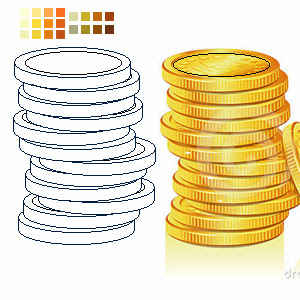
I took a long time to color the coins and the bow and arrow. the translation from shades into regular color and then to highlights, was a little harder to make on the coins, cause you need to give the idea of being a cylinder shaped object. The only thing I didn't have time to do was the lines changing colors, which give a greater impact on the shades and lighting.

Tuesday, October 15, 2013

Wk07 - Props Pixel Art Assignment First Draft


Basically I made two props, the coins and the bow and arrow. I also made a color palette that would help me color each prop, and its shades and highlights. For instance the coins have five different color palettes, having 2 color palettes to the show the shading, 2 color palettes to show the highlights and 1 color palette to show the regular colors of the coins. I did the same thing to the Bow and Arrow.

Tuesday, October 8, 2013

Wk06 - Game Logo Assignment Final Draft

I changed it to a more realistic texturized eye. The two fonts show more of a deadlier killer instinct. The movement of the things maintain the same, the text and the eye will move swiftly as if the wind is blowing them side to side. Also the menu will stay the same since the font is more of a serious mood, and that it is what I am trying to bring a Deadly / Serious mood. The smooth moving of the objects also show the stealthy way you need to work in the game (which is a stealthy assassin).


Thursday, October 3, 2013

Wk06 - Game Logo Assignment First Draft

I just started sketching title, logos and its combinations. The one that made me most interested in was the first one having the eye as the logo, and the title and subtitle being in a perspective view inside the eye. The thing I added was the light reflected inside the eye showing sharpness.
I got the idea of the fonts I will use for the title, the first one looks more as an adventure or action-like game. While the second font is more of a subtitle font which shows more a killer-like font. What I will try to do with the eye is make a brightness coming from inside as if a light is being reflected on it and in the same moment showing its sharpness.
This is the regular eye or in fact the logo of the game without the light reflection and without any writing just my previous creation.

That will be the combination of both the logo and the title, the only things that actually will change in the final draft are the subtitle being inside that combination, and since I created this combination before I chose another font, I decided to post this and warn the viewers that the font will also change.


Tuesday, October 1, 2013

Wk05 - Title Screen Assignment Final Draft

So you can observe that everything is in movement, the first thing is the eye and the cloud to give a sense of movement and of wind. The grass is also in a slow movement, changing opacity and having a smooth movement through the video. The title moves also to give an idea of a windy weather and to show that nothing is immovable. You can also observe the New Game changing color after the mouse pointer passes on the button and after being clicked you can see how the button will react in the end. Also the last thing I included was a sound track to show the mood of the game, a more serious game, built up with adventure and an extreme amount of action.